Continuing on the theme of interesting stuff I found out when researching how the R33 GT-R improved upon the R32 GT-R:
The Emblem:

The Emblem:
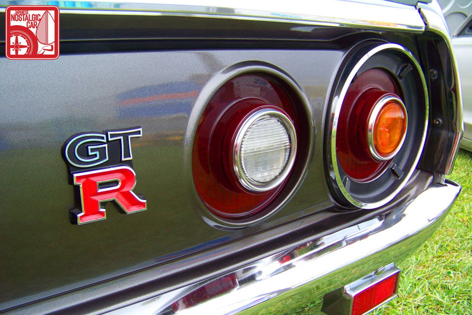
Nissan’s design division has one division that specializes only in emblems. For the RB26 GT-Rs, the GT-R logo used on the Ken Mary GT-R that debuted in Jan 1973 was the inspiration. That is, “GT” on top, a larger “R” on the bottom, and the “R” letter actually being silver outlined with red being painted within the outlines, to give it more presence.
 |
| From: http://japanesenostalgiccar.com/2011/09/13/events-2011-japanese-classic-car-show-part-01/ |
It turns out that at the time of the R32, the general design trend was to minimize badging or make them smaller, in order to give a clean look to the front of the car. Thus, the GT-R, like all R32s, only had the “S” symbol on the front hood, and only had the GT-R badge on the trunk.
However, the R33’s development chief Kozo Watanabe (who would later be in the same role for the BNR34), insisted on having a largish GT-R logo in the front as well, in order to strongly emphasize the car was a GT-R. This was in order to let cars ahead, when looking in the mirror, see that a GT-R was closing in from behind!
Nissan's chief designer of the exterior of the GT-R, Hiroshi Nishiizumi, had this to say about the GT-R logo:
“The large GT-R emblem is in the middle of the grill because there is only ‘dead space’ - the hood latch - behind it, so it hides this part which we don’t want to see. Also, the GT-R lettering is two level, just like the GT-R logo for the Ken /Mary GT-R.”
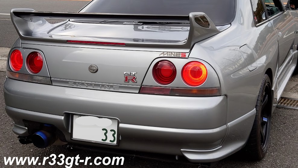
There is also a “GT-R” that is inscribed only on the left cover to the rear spoiler. Ever wonder why it’s only on one side?
This was done so that a driver being PASSED by a GT-R (in the fast lane in right hand drive countries,) would see at eye level, at the moment of being passed, what car had just passed him!
The logo designer was Ms. Junko Ito, who said her marching orders were to come up with an elegant and sporty design, larger than the 32 design on which it was based to reflect the larger mass of the 33, and fit it al into a square, while remaining well balanced. The "R" was made larger than the "GT", and there was a black background to the letters. Further the red used was more crimson than the brownish red used in the 32.
 |
| So this is the view in the mirror as a lesser car is about to be passed. From: http://www.skylinesaustralia.com/forums/topic/237956-in-motion-pics-of-my-r33-gtr/ |
“The large GT-R emblem is in the middle of the grill because there is only ‘dead space’ - the hood latch - behind it, so it hides this part which we don’t want to see. Also, the GT-R lettering is two level, just like the GT-R logo for the Ken /Mary GT-R.”
There is also a “GT-R” that is inscribed only on the left cover to the rear spoiler. Ever wonder why it’s only on one side?
 |
| From: http://www.driftireland.com/forum/showthread.php?36087-Genuine-R33-GTR-Spoiler |
The logo designer was Ms. Junko Ito, who said her marching orders were to come up with an elegant and sporty design, larger than the 32 design on which it was based to reflect the larger mass of the 33, and fit it al into a square, while remaining well balanced. The "R" was made larger than the "GT", and there was a black background to the letters. Further the red used was more crimson than the brownish red used in the 32.
The Steering Wheel:
This is one area where I think the R32 is better - its steering wheel, which was inspired by Porsche and BMW designs. The objective here was being able to turn the wheel by sliding your fingers. It is simple, clean and functional:
We all know that by the time of the R33, airbags were becoming mandatory. Hence the Series 1 BCNR33 had that monstrosity of a steering wheel taken from the Nissan parts bin. It did not even have the sporty red stitching found on the more compact steering wheel found on the Series 2 and 3:
 |
| From: http://jp.autoblog.com/2013/03/03/nostalgic-2days-2481km-r32-skyline-gt-r/ |
 |
| Series 1 on left, Series 2 and 3 on right |
I guess it could have been worse? The R33 GT-R Prototype's steering wheel:
 |
| Actually, this looks better - at least smaller - than the Series 1 one. All three photos above from: http://www.gtr-world.com/ |
What is NOT known is that it turns out the second steering wheel (for Series 2 and 3) was actually finished as a product and ready to go by the launch of the R33, but for parts sharing purposes, the decision was made to use the older one that ended up in the Series 1.
So, apologies to Series 1 owners, looks like you guys got stuck with some of the cost cutting going on at the time...
So, apologies to Series 1 owners, looks like you guys got stuck with some of the cost cutting going on at the time...
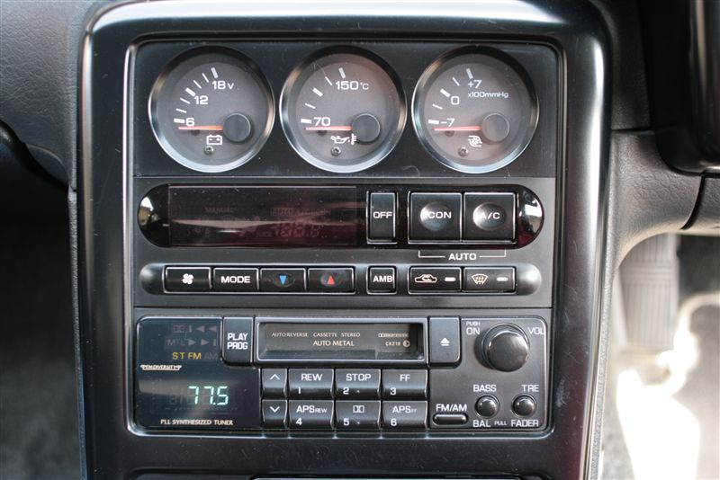
The Gauges:
When designing the R33 GT-R, Nissan designers followed the theme of "road going racer" - so racing drivers as well as Nissan test drivers were asked for the input in designing the interior. One trait as a result was the large number of gauges.
The sub meters were carried over, but improved upon the ones in the R32. On the R32, the gauges were pointed at the driver, but on the R33, in addition to having larger and more readable font, the fascia was cut to allow easy visibility without having to offset the gauges.
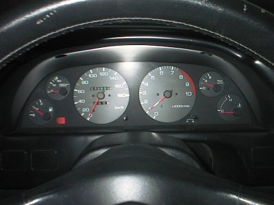
As for the main gauges, one small detail is the use of the imprinted carbon which in addition to the GT-R logo in the tachometer, was designed to separate the R33 GT-R from non GT-R variants.
Speaking of the tachometer - unlike in the R32, where the needles of both the speedometer and the tachometer were sitting, at rest, at the 7pm position (see photo above for the steering wheel) or the non GT-R R33, where the speedometer and tachometer needles both begin in the horizontal position - Why, in the R33 GT-R why does the speedometer needle point to 9pm but the tachometer needle point straight down? I've always wondered about this.
The problem with gauges with needles in the horizontal position (as was found in non GT-R R33 variants) is that the area where the rev limiter would kicks in (at 8000 rpm) is towards the bottom:
For the R33 GT-R designers, functionality was the most important aspect. But they also wanted an emotional connection with the engine as well: they wanted the driver to get excited watching the needle go up and down along with the engine revs. In other words, the designers wanted the tachometer to have a natural, wide angle of sweep, so the needle would rise from zero at maximum bottom below and peak near the red zone at the very top. Also, more practically, when driving at high speed, by having 7000rpm at the top center, it was easy to see at a glance that you were approaching the 8000 rpm red zone.
The designers also did a couple other things to emphasize the importance of the tachometer. First, they eliminated the voltage gauge found in the R32, and replaced it with a warning light, and then moved the torque meter to the 3 sub meters in the center stack area. By eliminating the number of surrounding gauges from 4 to 3 (leaving only one on the tacho side), this made the tachometer appear larger and easier to see. Also - it turns out that the color of the font on the gauges is actually not white, but a light grey for better visibility.
Compare:
The sub meters were carried over, but improved upon the ones in the R32. On the R32, the gauges were pointed at the driver, but on the R33, in addition to having larger and more readable font, the fascia was cut to allow easy visibility without having to offset the gauges.
 |
| OEM R32 GT-R Sub Gauges |
 |
| From: http://www.gtr-world.com/gt-r/bcnr33/bcnr33-skyline-gtr-4door-autech.html |
And all the gauges are all ROUND. Actually, other parts of the interior are round too, including the clock, harzard, defogger and even the HVAC switches. This was done on purpose, to create a link to the afterburner tail lamps. As one designer stated, "The beautiful circle is the Skyline philosophy."
As for the main gauges, one small detail is the use of the imprinted carbon which in addition to the GT-R logo in the tachometer, was designed to separate the R33 GT-R from non GT-R variants.
Speaking of the tachometer - unlike in the R32, where the needles of both the speedometer and the tachometer were sitting, at rest, at the 7pm position (see photo above for the steering wheel) or the non GT-R R33, where the speedometer and tachometer needles both begin in the horizontal position - Why, in the R33 GT-R why does the speedometer needle point to 9pm but the tachometer needle point straight down? I've always wondered about this.
 |
| From: http://www.skyline-forum.de/showthread.php/10001-NISMO-R33-320kmh-11k-TACHO |
The problem with gauges with needles in the horizontal position (as was found in non GT-R R33 variants) is that the area where the rev limiter would kicks in (at 8000 rpm) is towards the bottom:
 |
| Yes, it has the carbon look, but this is a BCNR33 gauge panel installed in an ECR33. From: http://minkara.carview.co.jp/en/userid/660687/car/1417373/6174645/parts.aspx |
The designers also did a couple other things to emphasize the importance of the tachometer. First, they eliminated the voltage gauge found in the R32, and replaced it with a warning light, and then moved the torque meter to the 3 sub meters in the center stack area. By eliminating the number of surrounding gauges from 4 to 3 (leaving only one on the tacho side), this made the tachometer appear larger and easier to see. Also - it turns out that the color of the font on the gauges is actually not white, but a light grey for better visibility.
Compare:
 |
| From: http://www.skyliner32.net/HNR32/img/after.jpg |
OR:
Amazing the little details they thought about, eh?
 |
| From: http://minkara.carview.co.jp/en/userid/1558931/car/1155628/4692855/parts.aspx |
Amazing the little details they thought about, eh?
Next: R33 GT-R Design Triva, Part 3: Wheels and Tires.
5 comments:
Awesome article!!
Nice info, thank you Aki!
Regards "The special one" ;)
Thanks Turbo! Most welcome Mr Special!
When looking up info on my r33 gtr, I always find your website and it has an answer. Thanks! I have a silver kouki like you too!
Hi Anthony,
Thanks very much for that comment! So happy you find this useful. If you are on Facebook, please find me and I will add you to our Secret invite only owner's Club!
Aki
Post a Comment