Blue vs Red Interior Stitching:
I've always wondered why Nissan did this. Why was the Series 3 given the red stitching, but the Series 1 and 2 blue stitching? Notably, the seats also have red or blue inserts to reflect the rest of the interior.
 |
| From a Series 1 car: courtesy http://www.gtr-world.net/gtr/archive/1858 |
 |
| Series 3 car |
Remember this is how the old logo looked:
The Series 3 cars did make the switch to red – but this was apparently because the main body color switched from midnight purple to silver (as can be seen in the TV commercials):
The "Speed King" commercial when the car was first introduced in 1995:
And then the Series 3 commercial in 1997:
Anyway, as everyone knows, the R33 seats are simply reupholstered R32 seats. A bit of history on the R32 seats. When designing the R32 seats, they had 2 goals - seats that could keep up with the GT-R’s performance, and seats ergonomically designed to fit well and allow for long drives without tiring.
So they looked and examined seats from Porsche, racing cars, rally cars, Recaro, and even seats with good reputations from other sports cars. But the most attention was paid to rally car seats. Most seats (at the time) really only supported the hips, but rally car seats support the hips, thighs, and shoulders, etc. in several locations. So the GT-R seat was based around a bucket seat design found in rally cars. Data on how the muscles move, blood flows were recorded and used. Initially, the seats held the shoulders more securely, but test drivers and journalists all reports this to be tiring in nature, so the shoulder areas were trimmed.
Also two different sizes were considered for larger and smaller drivers but eventually only one size was selected.
For the R33, different seats were again examined, including those from Group C cars, but they settled back on the R32 seats.
As for the seat material – initially the same stuff “exse-nu” (not sure of the spelling, as the name was in Japanese in the reference text) as on the R32 was considered, but a better material with better feel and finer fibers called Lux Suede was used. Although a NASA space material and real suede were also candidates, Lux Suede was selected in order to keep the seats as light as possible.
Incidentally, the rear seats of the R33 were designed in response to complaints that the rear seats in the R32 were too uncomfortable. (Both photos below courtesy of SkylinesAustralia.com)
Incidentally, the rear seats of the R33 were designed in response to complaints that the rear seats in the R32 were too uncomfortable. (Both photos below courtesy of SkylinesAustralia.com)
 |
| R33 GT-R Rear Seats |
Head and Tail Lamps:
Nissan designers had to design the head and tail lamps within the parameters of two design
elements specific to the Skyline.
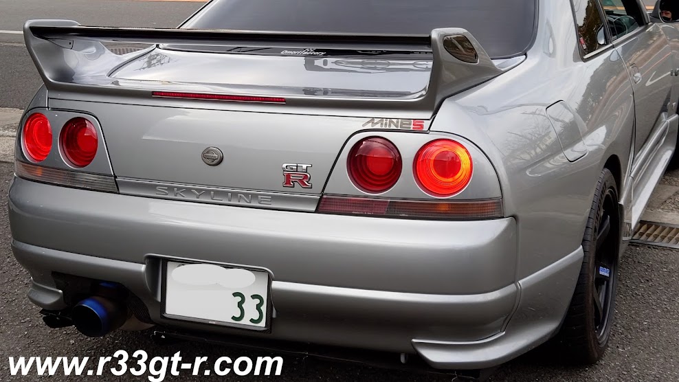
Everyone knows about the 4 rear afterburners (which in fact WERE inspired by the afterburners of jet fighters), but the designers also had
to follow the Skyline custom of having 4 head lights as well - apparently, every Skyline from the beginning had 4 lights up front, which is not true of all cars, for example Nissan's own Z cars did not.
 |
| AFTERBURNERS! |
 |
| "AFTERBURNERS" |
Speaking of the 4 tailights – it turns out that these rear
circular lights are actually not perfectly circular, but slightly oval. The reason for
this is that apparently, from afar, perfectly circular does not look circular (I've got to go out and measure them sometime!). Also, the designers also claim that the donut design is necessary to make
them look round as well.
The R33 GT-R headlights are different from the standard
R33. Naoto
Shiraiwa, who designed them, explains that the design was based on Group C cars, and further the image he wanted to have was two eyes
peering out from behind a visor shield of a racing helmet.
It also turns out that light manufacturers wanted Nissan
to use projector headlamps (like in the 32), but these required more depth than halogen lamps and
further initially these lights were large and their use gave a disjointed look.
 |
| From: http://www.lacar.com/?p=9538 |
Incidentally, the R33 GT-R’s outer lens actually has vertical lines
inscribed – this is so that if viewed from the side, the lens (apparently) gives a glitter
effect! What was also important from a design perspective was to
make sure that these headlights actually looked like lights – looking securely
forward.
The headlights on the 33 GT-R are actually 20mm forwards
that of the standard R33. This was
because it was not possible to keep inside the hood area.
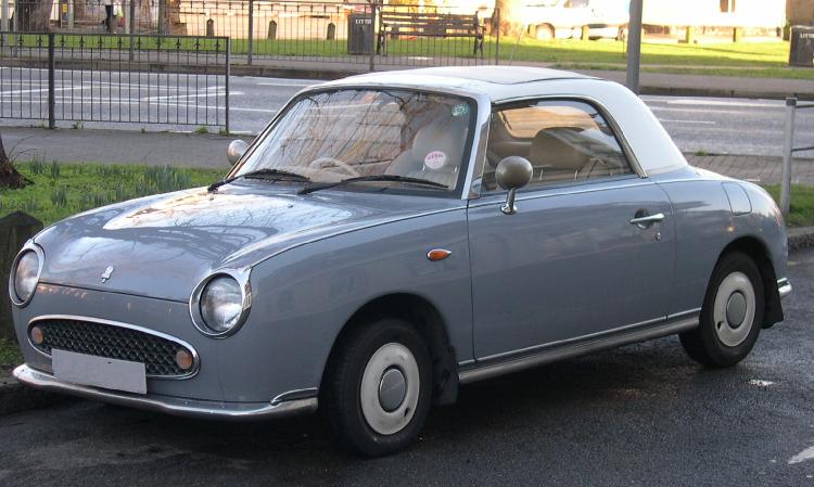
The front round turn signals were borrowed from the Nissan Figaro, although
the color is amber to make distinctive. These lights were also later used in some 180SX models as well.
 |
| The Nissan Figaro. The resemblance is uncanny (not!) |
 |
| from http://www.sillbeer.com/blog/entry/sweet-nissan-180sx-type-x-on-yahoo-japan-auctions/ |
Finally, what Shiraiwa wanted to do was to have an “S” mark inscribed in both the 32 and 33 headlights. (in the photo of the R30 headlamp below, you can see an “S” mark between the two lamps, at the top where the light doesn’t hit).
Next in R33 GT-R Design Trivia, Part 2: Emblem, Steering Wheel and Gauges


wKBP4IeVW,K!~~60_57.JPG)
5 comments:
Awesome write up, really reminds me why i love Nissan. The old Nissan that is, not the Costkiller era!
Thanks Stj88! Yeah this real otaku trivia, but I agree - the old Nissan was so cool, full of character... remember the Skyline Silhouette racing cars, for example...
Really love your blog! Thinking of selling my BCNR33 midnight purple S1, but after Reading everything you write about im not so sure i wanna sell it. I love that car!
Thanks Johnny! If you sell, what would you replace it with? Don't sell!
Has anyone ever tried installing the R33 GTR Nismo seat covers on the R32 GTR seats?
Post a Comment